
pattern based on the eye direction of the Beatles revolver album cover

pattern based on the eye direction of the Beatles revolver album cover
I created this images by placing dots as the eyes of the original cover.

The dots could also represent bullet holes

I created these images by setting up paragraph styles

Version 2


I have created these images based on the hair of the original.

Using the original as a guide. I traced the image using the line tool

The line thickness, direction and space between the line was determined by the hair on the album cover

I duplicated the pattern created to produce this image

looking at the cover – the thing that stood out was the eye direction.
I have conveyed this in the images below

and here

and

“I would like you to analyse the following record sleeve ‘Revolver’ by the beatles and then produce a typogrpahic version with no illustrations or photographs.
Format: front album sleeve 12 x 12 inches
write down all of your observations/ information in a legible list which we will discuss in the day.

For some reason I quite like this odd colour combination design. I think it needs some more work on it. It is a development of an earlier poster I did (see February 25th, 2010 entry). I created this poster in indesign, using the grid function to help.

closeup 1

closeup 2


close up of micro text

closeup of song pattern – a represenataion of sounds used in 409 second song timeline

Not sure I am quite happy with these developments!

.

.

.

I’m not these colour combo work aswell as the green/pink as they don’t quite reflect the song.


The following may be a bit garish!

Like this one!


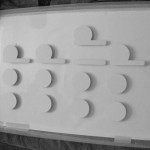
After listening to the track over and over again:I concluded that there where about 8 sounds that where repeated that I could hear. I created a timeline for this song and marked on the timeline when each sound appeared in the song. The results can be seen below. Hopefully you should be able to see a pattern created for the music
The pink represents voice:
Please note: I’m not a musical buff!

I found this poster was a bit tooo busy and needed some breathing space, hence the above image.

An experiment:

The Process
The smaller dots represent quieter/smaller symbol sounds – that are almost background

Eszett (B shape) – german voice. Eszett are german characters which represent “ss” e.g schloss can also be written with an Eszett on the end instead of a double ss

[ – expo

a – English voice

The “/” represent a sort of wavery background repeating beat.

The W – represents a sound at 1:04 – 1:22 to me the sound looked like a repeating WWWWW shape

The ⊿ – triangle shape represents a swoshing sound that starts quite quiet and then gradually increases in pitch

The º green dots represent a big electronic type symbol sound

I have decided to change song. to Kraftwerk’s expo 2000
each dot represents a second of the song. the song is 408 seconds long, there are 408 dots. The magenta dots represent a symbol type sound in the song.

Similar ideas below:

and here:

I thought this just looked interesting!

This poster is a moodboard of ideas, shape and colours for the expo song.

I created these posters using indesign’s grid function. I was trying to represent an equaliser/ wave formation for my chosen song.


Whilst preparing the poster image for this blog , I was in photoshop and accidently created the below effects to these posters. I quite liked them so uploaded them.


These posters where created using water and ink and cut out lettering.


I designed this font using indesign. The idea was to create a fun simple font.

An idea of what the poster will look like with coloured inks floating around the letterforms


I have worked with Alice Taylor for the first week of this project
I decided to choose mint royale: singing in the rain for my chosen song.
I wanted to represnt colour, fun, joy in my poster, as when I listened to the song these emotions I felt the song portrayed. I want to create a poster that will put a smile on their face.
When I went to paris, I saw this building which I used as a starting point.

I love the bright colours and pipes.
Doo-dloo-doo-doo-doo
Doo-dloo-doo-doo-doo-doo
Doo-dloo-doo-doo-doo-doo
Doo-dloo-doo-doo-doo-doo…
I’m singing in the rain
Just singing in the rain
What a glorious feelin’
I’m happy again
I’m laughing at clouds
So dark up above
The sun’s in my heart
And I’m ready for love
Let the stormy clouds chase
Everyone from the place
Come on with the rain
I’ve a smile on my face
I walk down the lane
With a happy refrain
Just singin’,
Singin’ in the rain
Dancin’ in the rain
Dee-ah dee-ah dee-ah
Dee-ah dee-ah dee-ah
I’m happy again!
I’m singin’ and dancin’ in the rain!
I’m dancin’ and singin’ in the rain…
[ADDITIONAL VERSE]
Why am I smiling
And why do I sing?
Why does September
Seem sunny as spring?
Why do I get up
Each morning and start?
Happy and head up
With joy in my heart
Why is each new task
A trifle to do?
Because I am living
A life full of you.
Using only typographical elements create a poster using a piece of music.

Poster proposal
For hidden exhibition.

i decided to redo poster version2. As i felt the design was a bit messy and needed to look more clean. I think I have acheived this by changing the background colour to white and make sure the order of the colour in the table appeared in a consistent order.


Our next brief was to take the document and turn it into a A4 document. WE could use folds but only 3. As this is a leaflet it needs to be more micro than the poster which is more macro focused.


I deicided to organise the information by date and then by location.


I started this project by deciding to apply the darkroom processes to type: expose, wash, fix etc. However with the 20 sec limit – I realised this could be quite tricky. So took one element: light. I experimented using adobe aftereffects to create some movies. I eventually decided to have my type move to waves. This led to incorporating sound. This took a lot os developing and research – but am happy with my end result, as the types outlines are soundwaves which change depending on the wavelength.