/* D&AD */
ANNUAL 2013 DESIGN
/* bath school of art and design */
UCAS identity
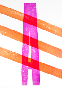
/* Lettepress 'A' POSTER */
experimentation
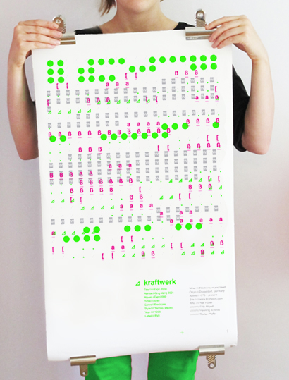
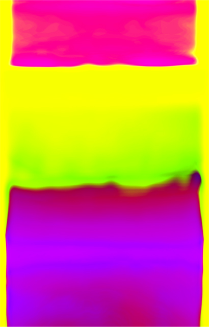
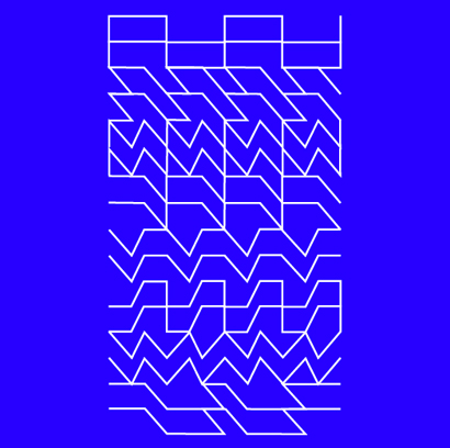
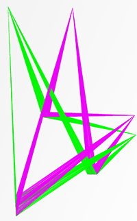
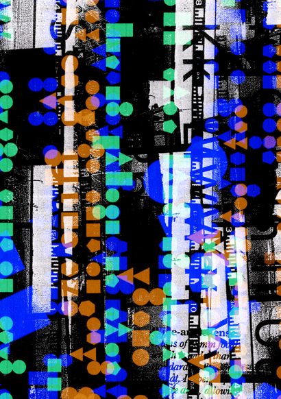
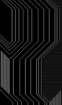
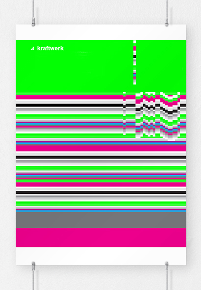
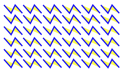
/* KRAFTWERK MUSIC POSTER */
Using typography to represent the different sounds and beats
/* D&AD */
ANNUAL 2013 DESIGN
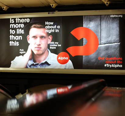
/* alpha */
new identity
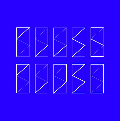
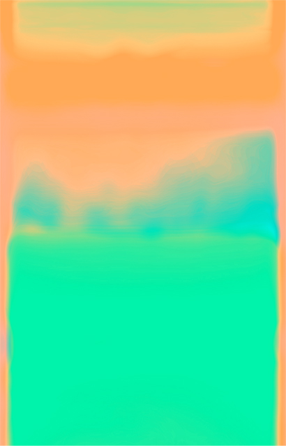
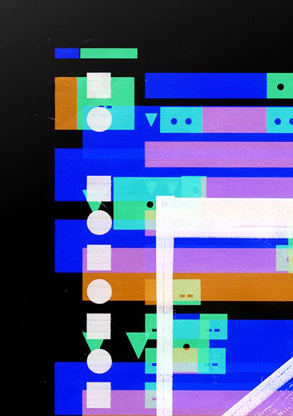
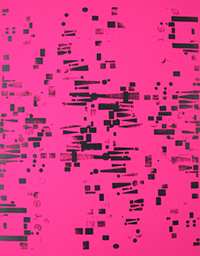
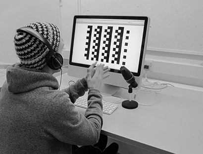
/* PULSE AUDIO */
NEW IDENTITY
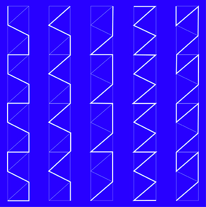
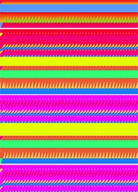
/* Diesel brief inbook winner */
Sound reactive patterns
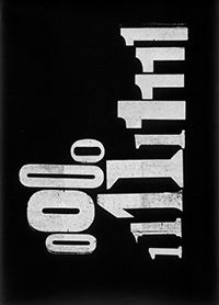
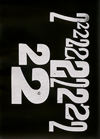
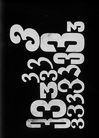
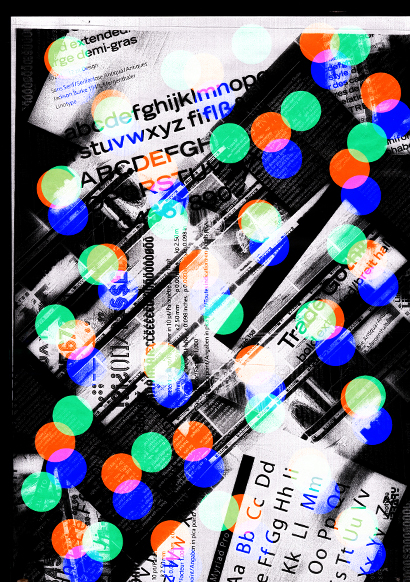
/* Lettepress */
numeral play experimentation
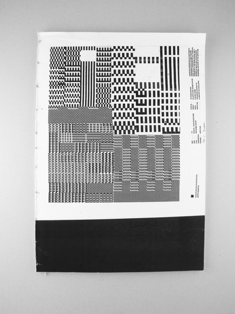
/* Processing */
Experiment with joining lines
/* photocopier play */
EXPERIMENTING WITH PRINTERS AND PHOTOCOPIERS.
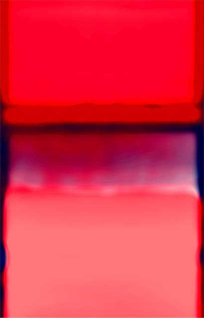
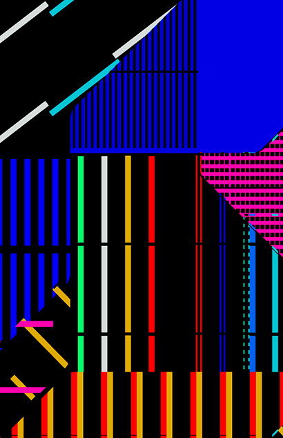
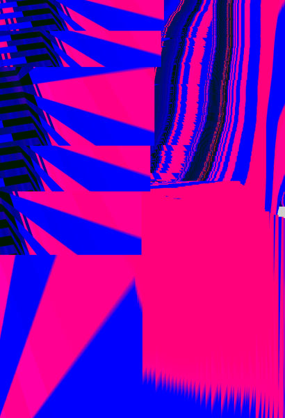
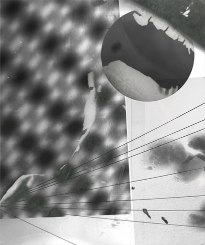
/* poster red blue lines*/
experimentation


/* Spiral experiments */
digital vj
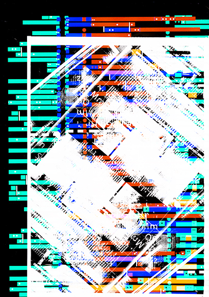
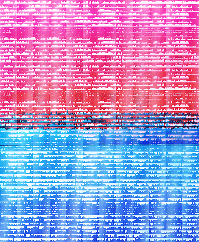
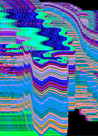
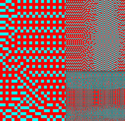
/* Glitch */
I love the patterns from glitches here are some from my mac.
/* SEWAGE WORKERS */
I DOCUMENTED THE PEOPLE WHO WORK AT THE SEWAGE SYSTEM IN BRISTO MAKING
VISITS TO THE WATER TREATMENT SEWAGE FACILITY IN AVONMOUTH, I produced A BOOK WITH DIAGRAMS OF THE
PROCESS AND INTERVIEWS.
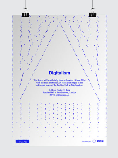
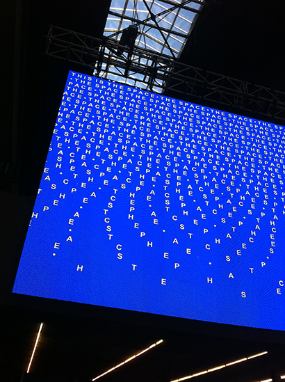
/* The space identity */
Launched at the tate, a project with Wolff Olins
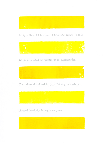
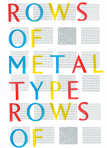
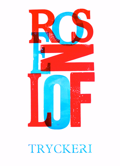
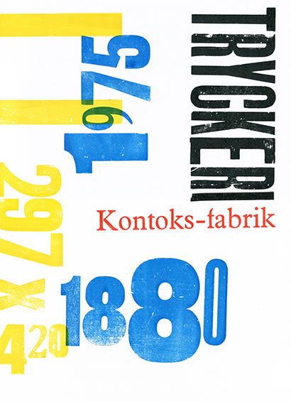
/* ROSENLOF PRINTING WORKS poster series */
INSPIRED BY THE MASS OF PRINTING PRESSES, ABANDONED
TONS OF METAL AND WOODEN TYPEFACES at Sweden's abandoned ROSENLOF PRINTING Press whcih closed down
in 1975
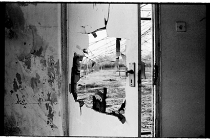
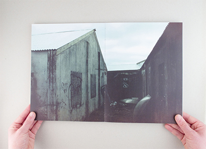
/* Hidden places photo book */
I DECIDED TO SEARCH FOR MORE PLACES THAT WERE LEFT, NEGELCTED AND
FORGOTTEN.


/* American flag play */
UNTIL 1912, THERE WAS NO SET DESIGN FOR THE STARS AND STRIPES. THIS
RESULTED IN FLAG DESIGNS REFLECTING POLITICAL AFFAIRS OR SOCIAL COMMENT. TAKING THIS AS INSPIRATION
I SET TO DESIGN 25 USA FLAGS
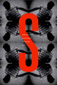
/* Lecture posters */
Simon Larbalister, created with repeated exposed newspaper cutting
/* Lettepress '!?.' POSTER */
experimentation


/* play typeface */
A typeface exploring play
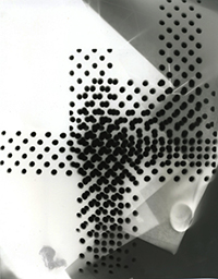
/* Dark room experiements */
Created by exposing microchips
/* Screen Glitch */
forcing a glitch on loadup
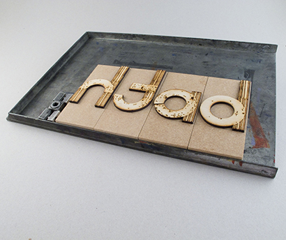
/* bath school of art and design */
alphabet wood blocks made with laser cutter
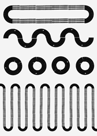
/* Tube map patterns */
I'm a big fan of the tube map i created some patterns based on the tube
lines and shapes as inspiration.
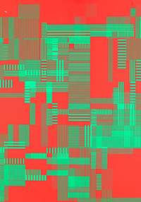
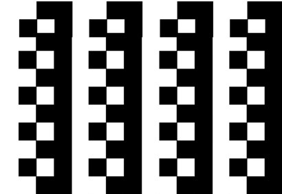
/* pattern */
silkscreen poster made form repeating lines
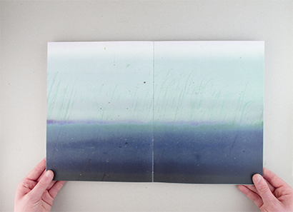
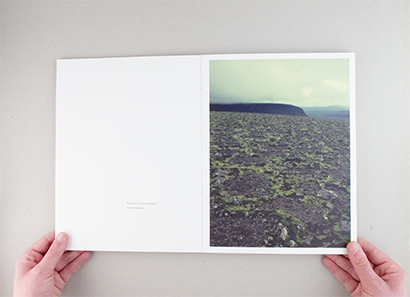
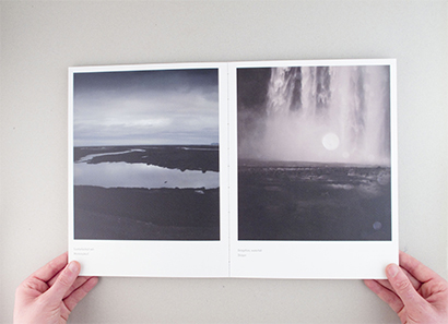
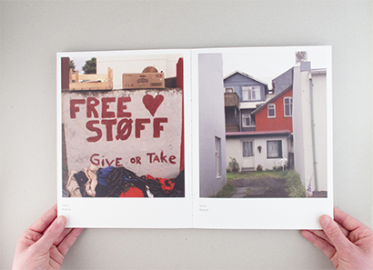
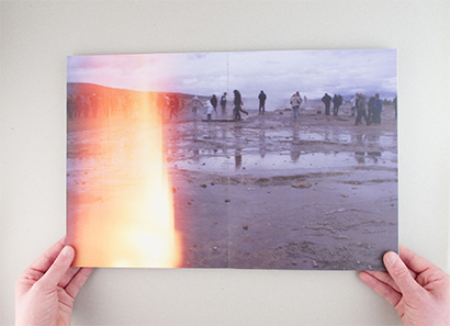
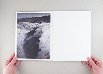
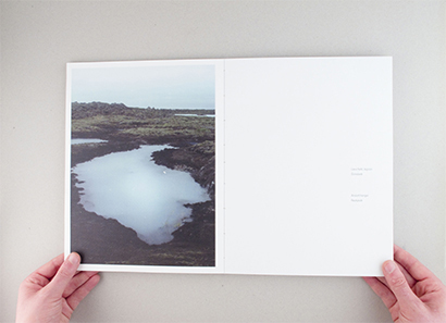
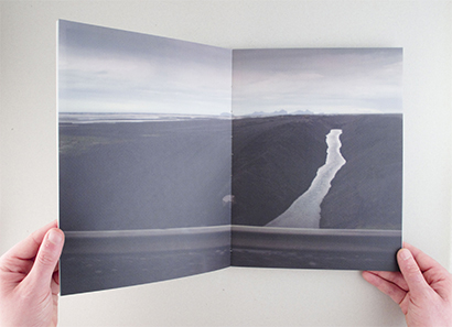
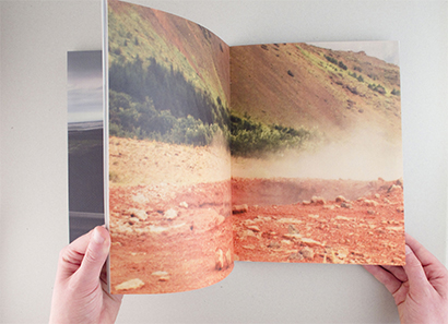
/* Iceland */
Photo book
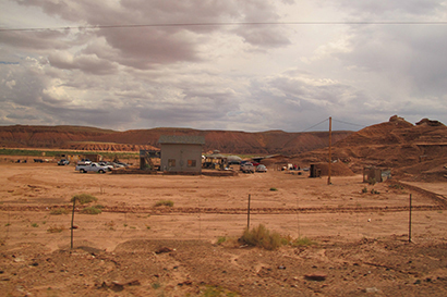
/* America */
Arizona
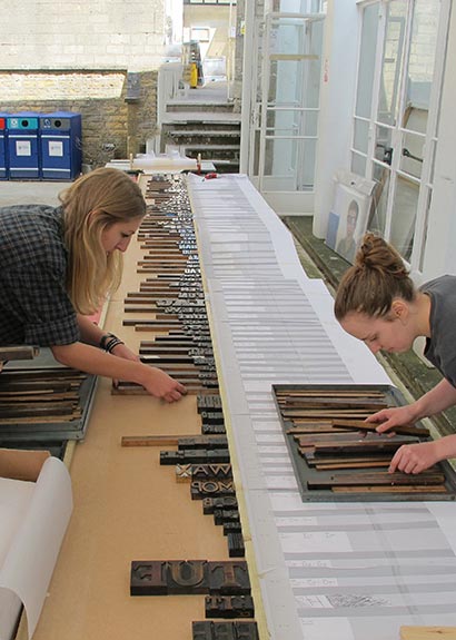
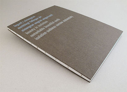
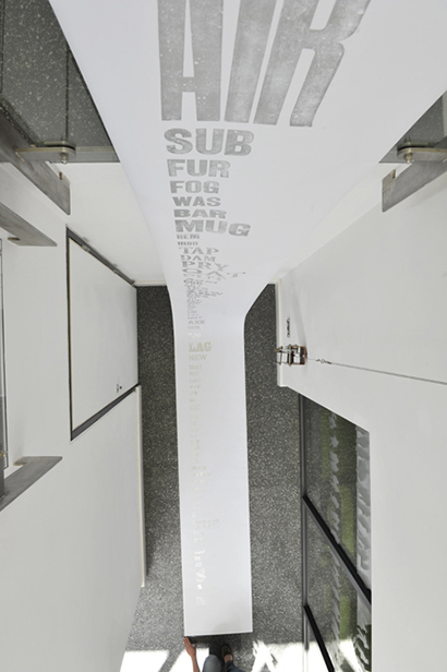
/* letterpress on a giant scale */
7 metre letterpress banner to demonstrate and show case bath
spa range of wooden letterpress type.
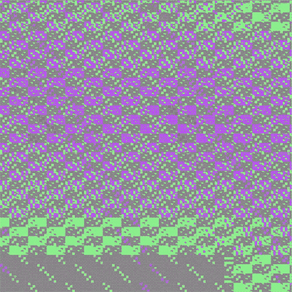
/* glitch pattern */
Created by intentionaly glitching repeating lines
/* letterpress on a giant scale */
7 metre letterpress banner to demonstrate and show case bath
spa range of wooden letterpress type.
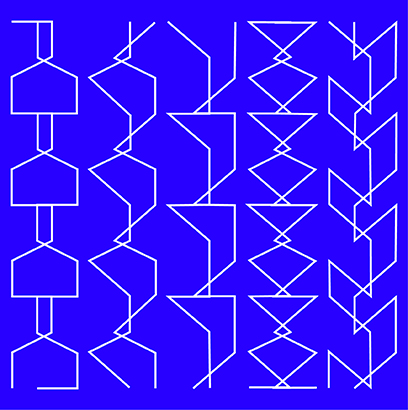
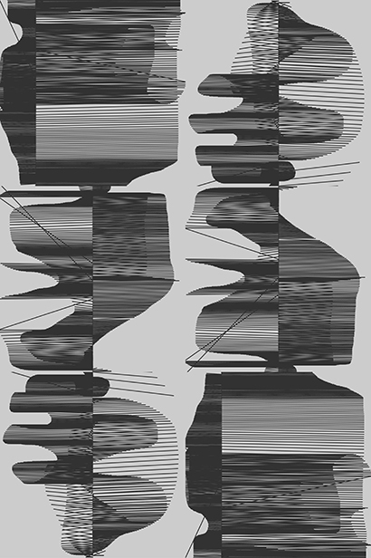
/* Diesel brief inbook winner */
Sound reactive patterns
/* china */
Yangshuo
/* Kraftwerk music poster 2 */
created with tables
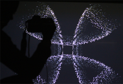
/* Play with projectors and cameras*/
vj
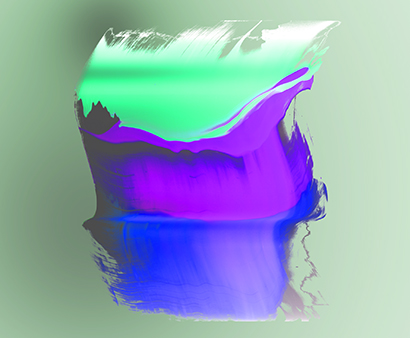
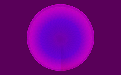
/* Wave */
paint + c4d
/* Diesel brief inbook winner */
Sound reactive patterns

/* Play with c4d*/
c4d
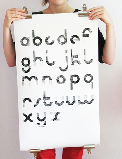
/* bath school of art and design */
printed alphabet
/* Processing */
Experiment with pmouse
/* processing pattern */
Created using mouse movemnets

/* tape */
TAPE PLAY + CODE
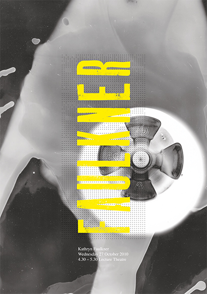
/* Faulkner poster */
created with photograms
/* zzzz */
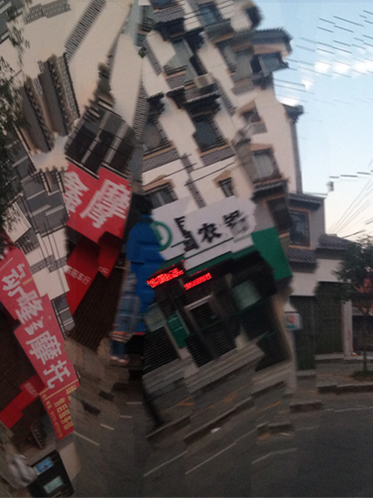
/* Mexican Glitch */
Created by forcing a glitch on grads and patterns
/* Pixel pattern */
A play with processing

/* repeat pattern */
A play with processing
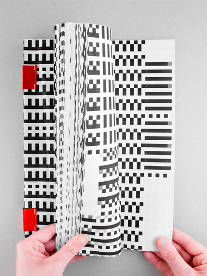
/* D&AD */
Kraftwerk sound reactive book

/* repeat pattern2 */
A play with processing
/* photogram */
collage + darkroom
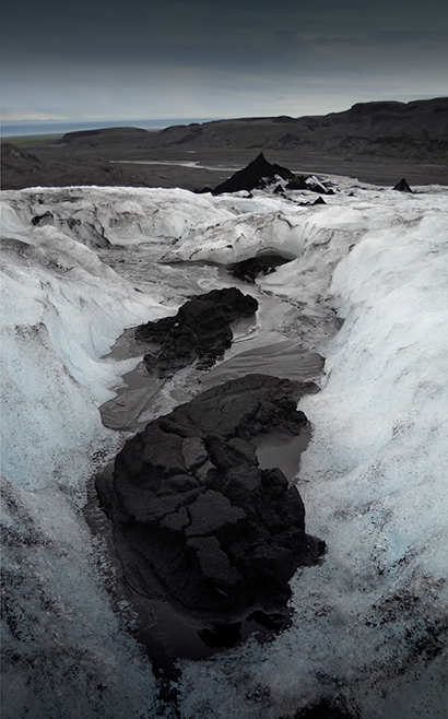
/* iceland */
dark ash glacier