Archive for the ‘/ / / / / post uni’ Category

photocopier series
Friday, June 1st, 2012

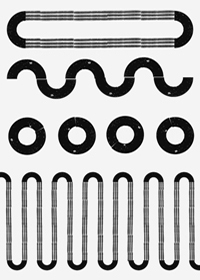
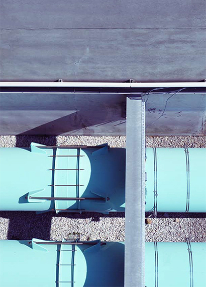
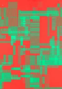
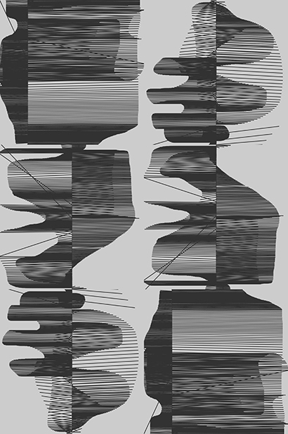
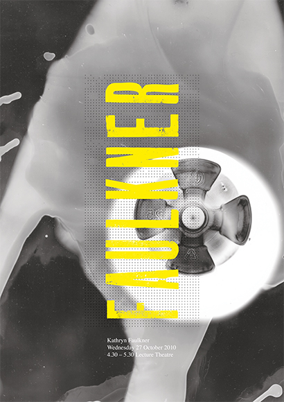
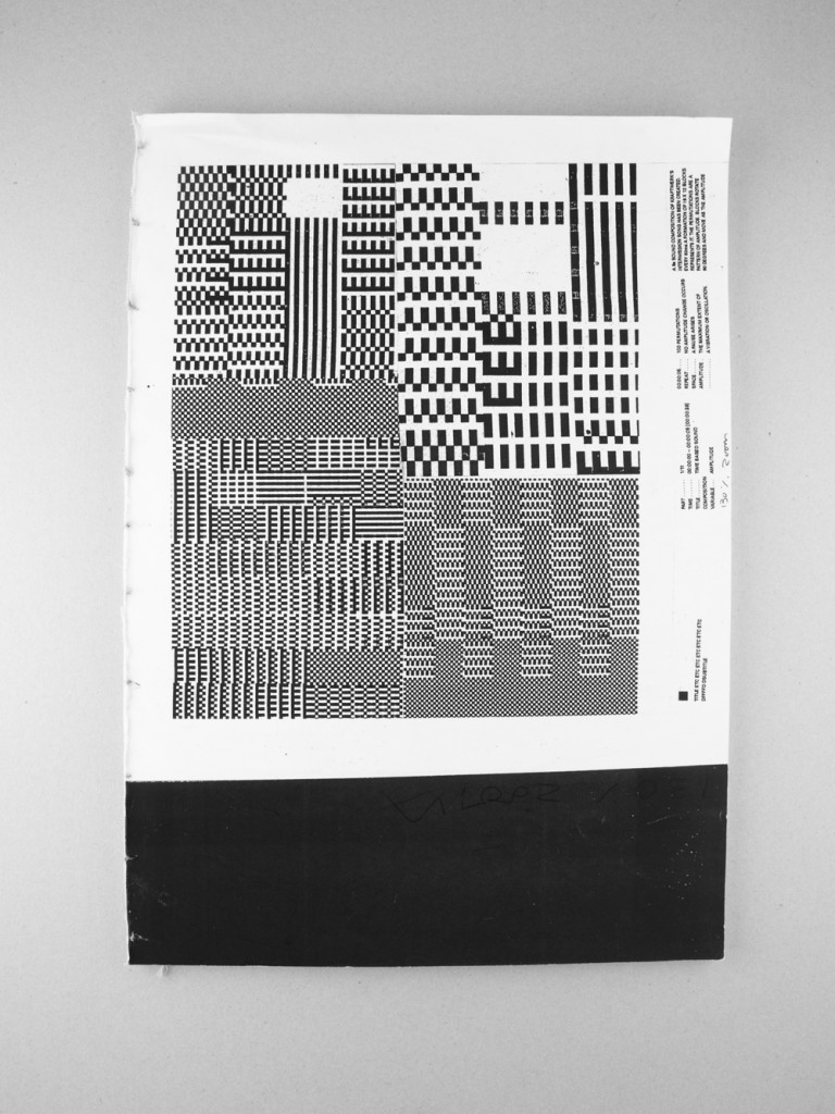
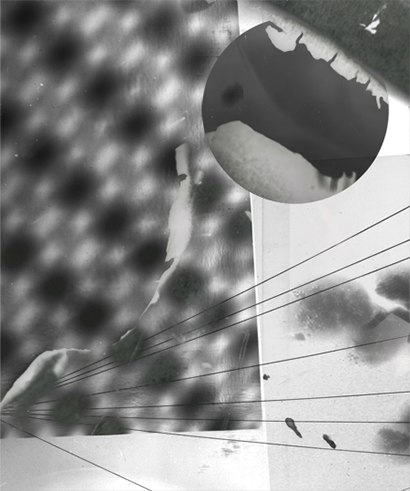
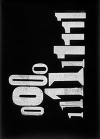
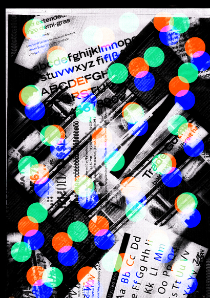
I had a bit of fun playing with a photocopier today. Here I photocopied a photocopier part.
I’m thinking this could start a series, of photocopied office?

Wallpaper* Graduate directory

Monday, January 2nd, 2012

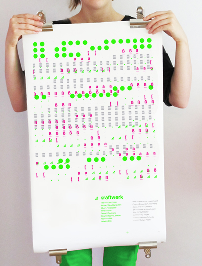
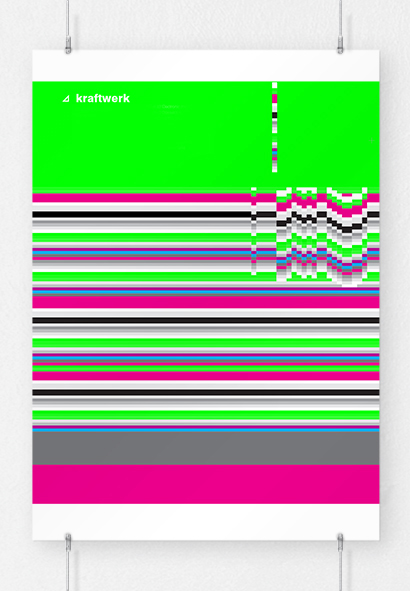
Jan 2012 issue of Wallpaper* featured the graduate design directory, my kraftwerk music piece was featured in the visual communication section. see here

Here is a screenshot from the Ipad app.

wallpaper-small

pulse audio brand

Sunday, January 1st, 2012

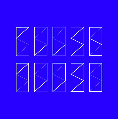
pulse audio is a music composing and sound engineer company. Given the task to create a brand, I show some initial designs below:

pa16

pa26

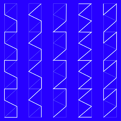
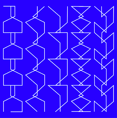
All design components and logo use the frame work of the same shape, which I then used as a grid, see below.

pa2

pa15

pa20

pa21

pa22

test7

line play poster

Monday, December 5th, 2011

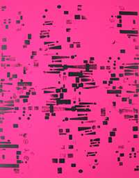
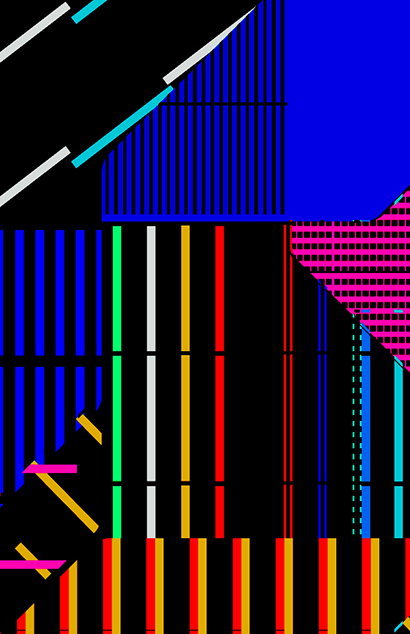
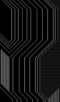
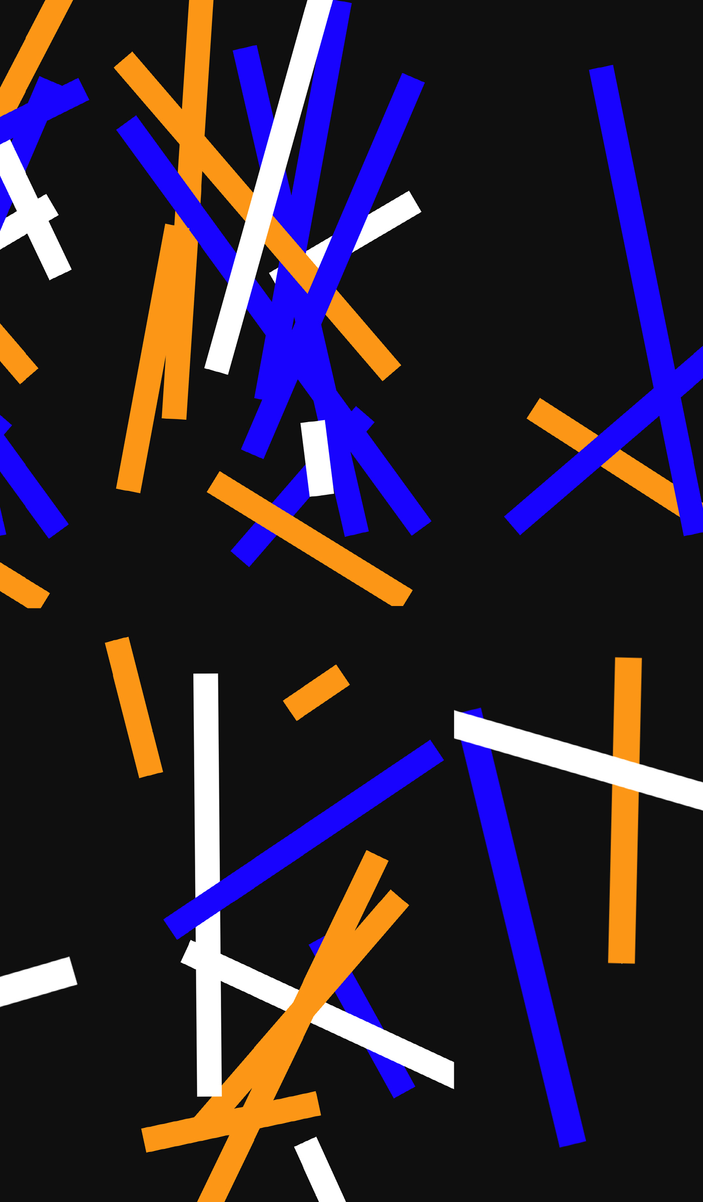
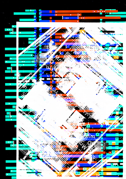
I created this poster based on music waves using a photocopier and lines in inDesign.

cyanlines_s

Sky-scrapper Patterns

Saturday, December 3rd, 2011

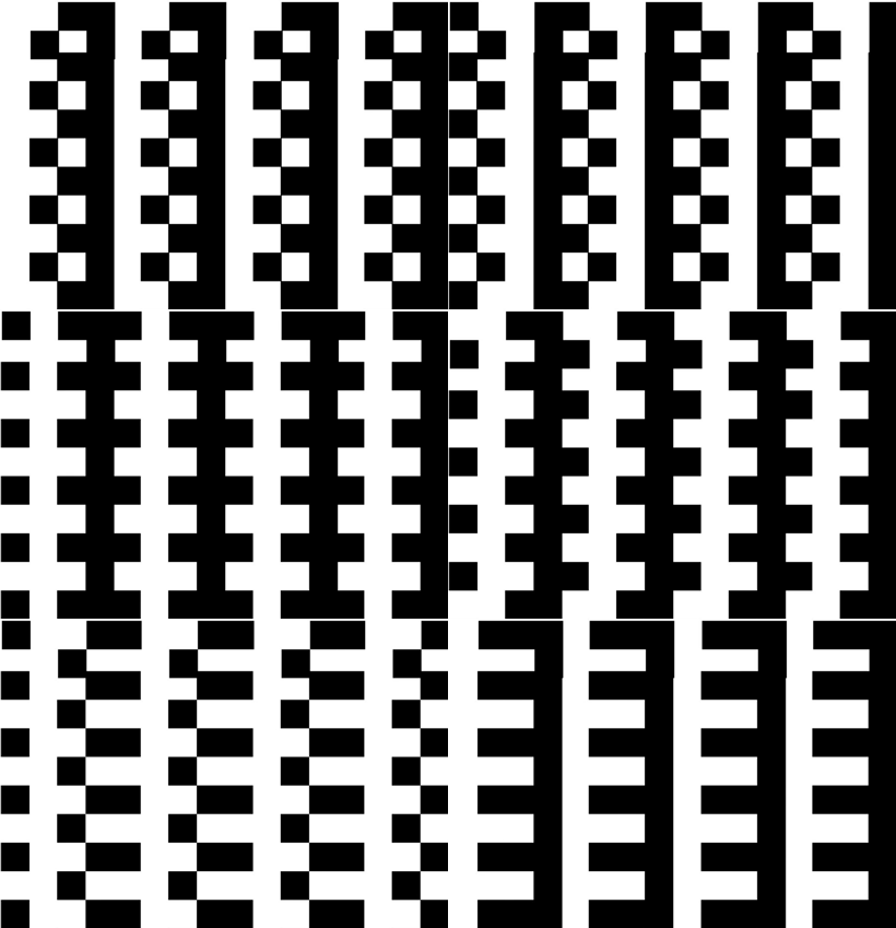
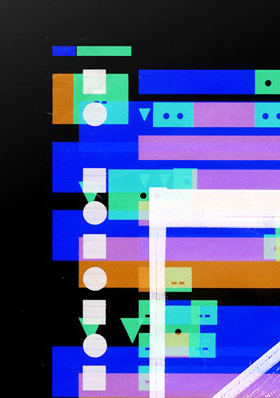
I created this pattern using a photocopier and overlay colour modes and repeated rectangular shapes.

Capture 8

Cropping into the image creates some nice results and patterns

Capture 9

The original image, click to view bigger

4858_003333

graph play montage

Wednesday, October 26th, 2011

Using a tumbling block graph I created the below:

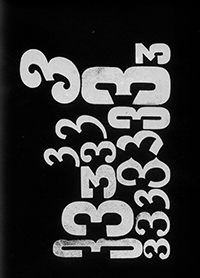
pw34

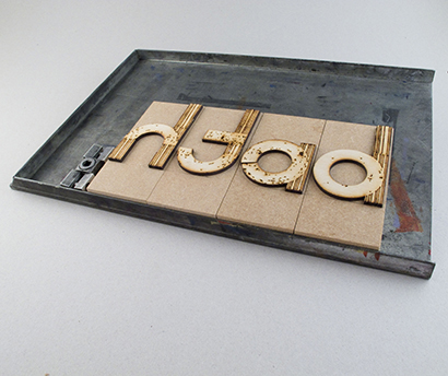
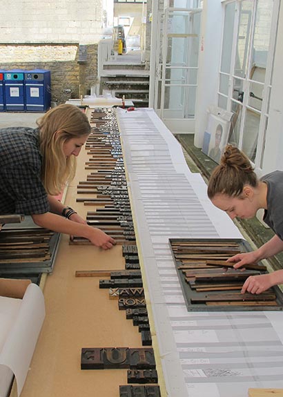
I then used some letter-pressed U’s

pw25

Polar

Friday, October 21st, 2011

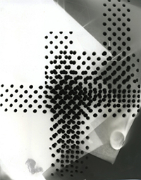
Created using photograms and polar shapes

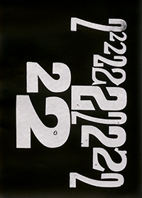
test225

Creative Review profile

Friday, September 30th, 2011

Creative Review featured me in their graduate issue, sept 2011.
Click here to view.

“Equally at home with paper and ink as she is working on screen, Fleur Isbell’s design approach often combines the two within a single project. Rather than seeing analogue and digital as separate disciplines, both media are, for her, simply platforms from which to explore and play…”

cr

Pentagram Competetion

Friday, September 30th, 2011

As part of the emerge exhibtion which will run during design week, I was asked to enter a brief set by pentagram.

The brief asked to choose a piece of typography that came from London and express it on a landmark.
This was my response.

fleurisbell-submission

Forty years ago the Beatles crossed Abbey Road and the photo taken was used for their final recorded album. Since then Abbey Road has become synonymous with the Beatles and London in the swinging 60s. It has become an iconic landmark; a shrine for thousands of fans who visit Abbey Road every year trying to replicate the famous zebra crossing pose. Analyzing a web cam located above the crossing, the poster is a representation of fans crossing on John Lennon Day 2010. Using this information, I applied it to the album lyrics of “Come Together” with the idea that fans become participants in the design creation. Every letter or character of the song equals a second represented by a bar as people step onto the crossing. These representations are black when they cross left to right and red when they cross right to left. It was interesting to note that the end result resembled a sound desk, a piece of music or a keyboard – and a zebra crossing! Other interactions are recorded on the poster key. When fans step onto the crossing they interact with the design and the lyrics. For example in the final line,’Come together’ where there are four letters, four people crossed at the same time. A further outcome would be to project the design onto Abbey Road studio; a speaker would play sound-bites from the album corresponding with the fans’ movements on the crossing creating a ‘fan-made musical score’. For instance if 3 people walk on the crossing at the same time then 3 sound-bites will play; when they pause, the sound will stop.

Creative Review illustrations

Friday, September 30th, 2011

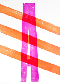
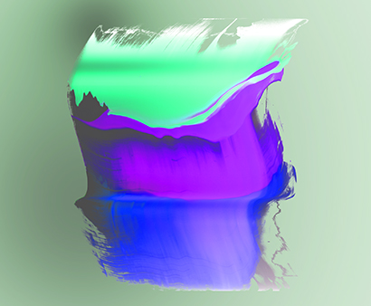
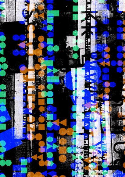
Creative Review Magazine, asked me to illustrate their back cover as part of their Graduate special issue, Sept 2011.

This is the illustration they chose, which you can see on the back cover of the sept issue of CR

variation3

Picture 2

Experimenting with shapes, textures and colour.

port-test-6

Experiments

Tuesday, September 27th, 2011

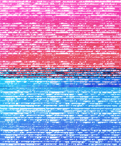
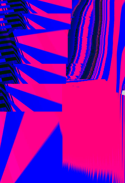
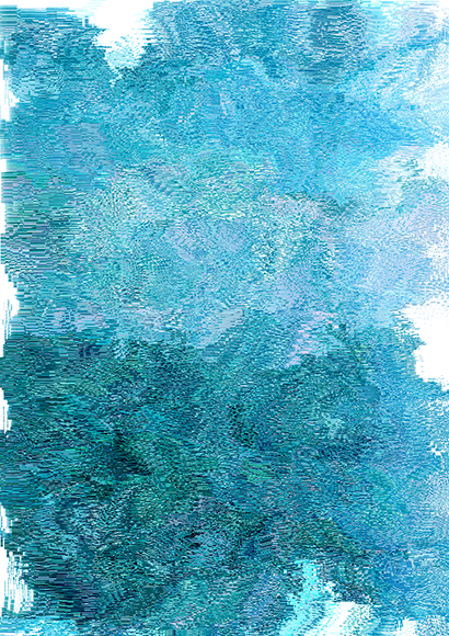
Adjusting and experimenting the pixel dimensions I created the below image:

pixel

I then played with shape and scale

test2

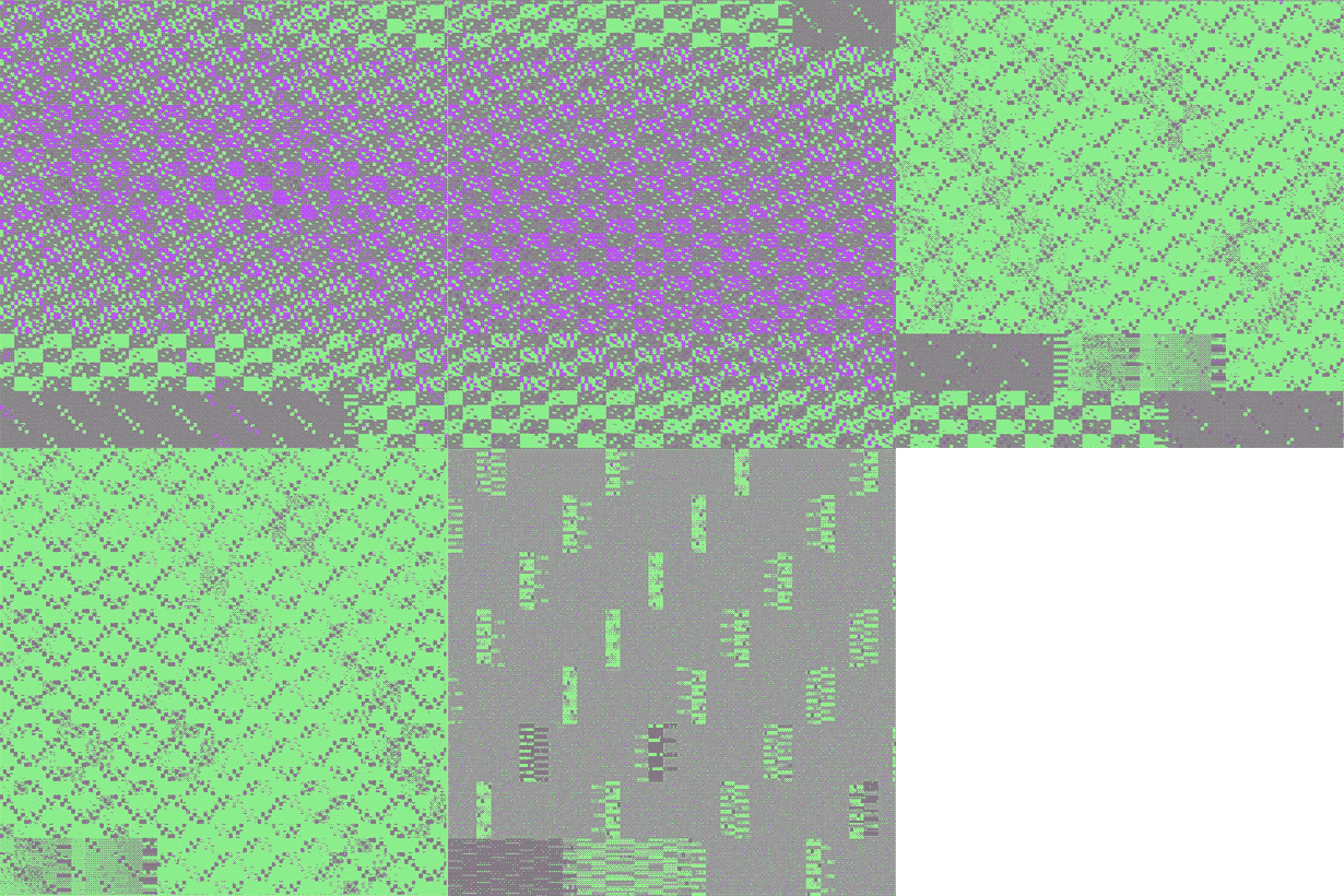
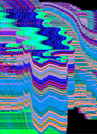
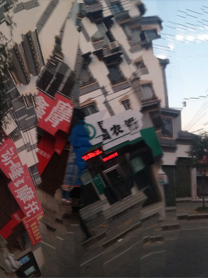
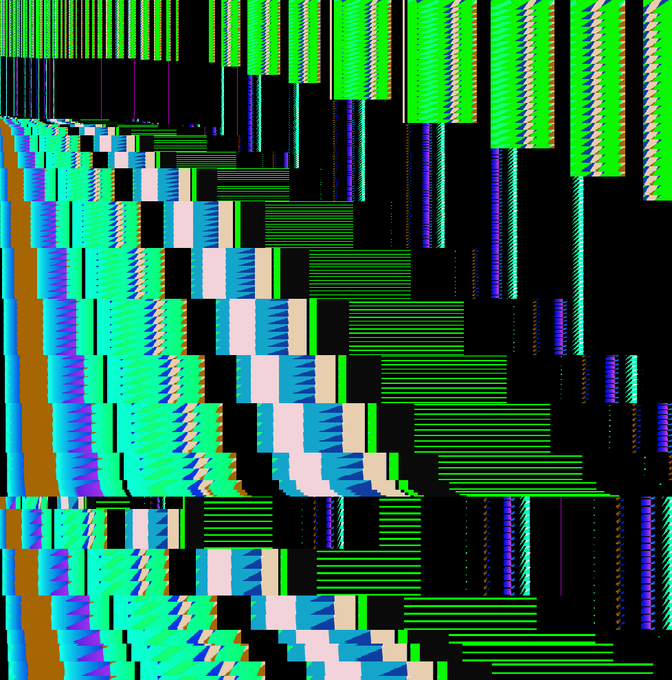
When I was at the Emerge exhibtion I came across work by Jamie Reid, who created “mashed-up” data file images. Taking this as inspiration, I took a Jpeg of one of my letterpress scans and open it in a text editer I then replaced the õ to a letter F, using the cmd F function.

This was the result

datad2

Emerge Exhibition

Sunday, September 25th, 2011

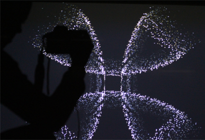
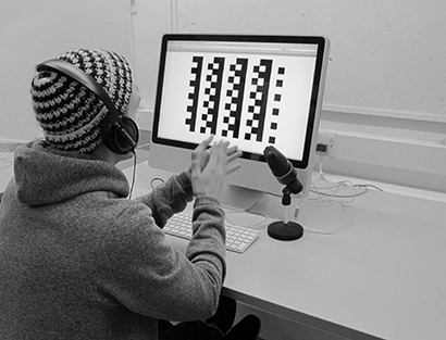
This week I have been involved in setting up for the emerge exhibition, where I will exhibit my user generated sound installation. Emerge are a group of designers chosen by companies in industry to exhibit their work. My work was recommended by Jim Northover of Llyod Northover, so a big thank you!

this is emerge profile
about emerge

IMAG0201xb

aIMAG0227

Video of me talking at the emerge event, explaining my designs:

Capture 3

Featured in design one blog

Wednesday, August 31st, 2011

I was featured on the design one blog

“Design One is back to blogging after long summer with this massive young talent – Fleur Isbell. Recently graduated from Bath Spa University, Graphic Communication, Fleur is having a great eye and large scale ideas in digital experimentation. Furthermore, these experiments end up gracefully with smart modern touch, exactly within the taste radar of Design One. Besides the great visual language you may also enjoy the Isbell’s blog which is equally exciting. Indeed, the Design One blog could hardly give the full details of Fleur’s work but if it triggered your curiosity the job is well done, now switch to fleur.isbell.net and enjoy”

See here blog article, “Bath full of vision”

Capture 15

d&ad Graduate academy

Tuesday, August 30th, 2011

This week I have been taking part in the d&ad graduate academy. Where the “top 100 creative graduates” where invited to take part a week long bootcamp. The week was brilliant, met some great people and learned loads! A big thank you to Kin design, Mother and onedotzero who ran the cascade brief and helped out, it made my week!

ga05

What a team!

ga01

ga02

ga03

ga04

ga07

ga06

See more here http://oneinsight.tumblr.com/
and information about the d&ad grad acad http://www.dandad.org/talent/graduate-academy

d&Ad new blood

Thursday, June 30th, 2011

“The new generation rises” Thur 30 June – mon 4 july 2011
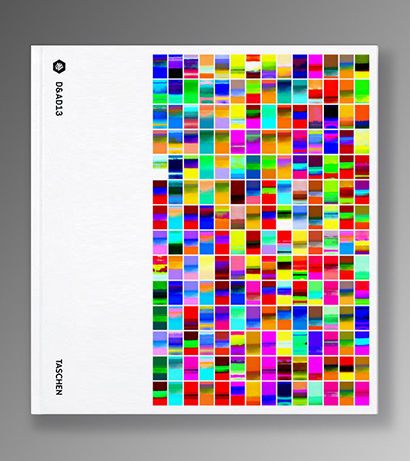
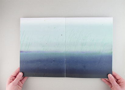
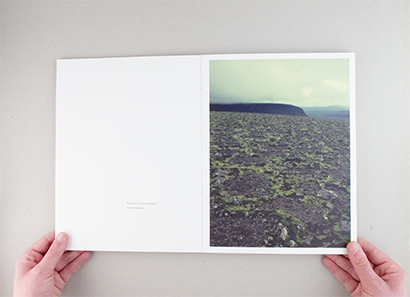
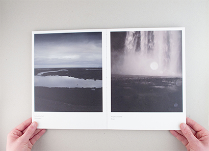
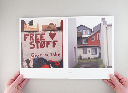
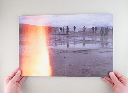
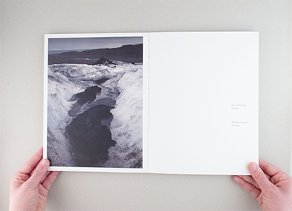
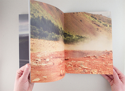
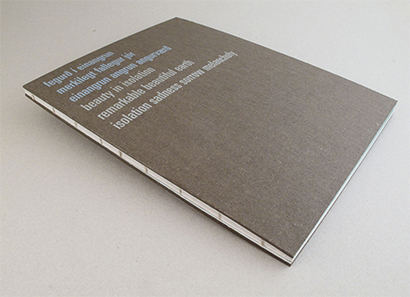
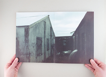
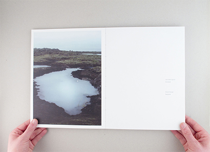
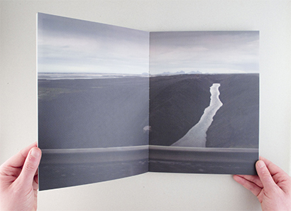
As part of D&ad new blood my icelandic book, letterpress catalog and d&ad kraftwerk illustration digital piece was exhibited.

IMG_2138

Bath spa stand at D&ad

IMG_2134