Just wanted to play around with colours and shapes

some more


Just wanted to play around with colours and shapes
some more
I created the original font using a repetition of 3 design parts as seen below.

Giving myself a restriction, I set about creating patterns and compositions.

An idea could be that when I creat my letterpress font i get circle and line design parts cut out so other people can construct their own patterns too.


I think it would be nice to create a tool kit of design elements for people to construct their own patterns.

I created these images by repeating and inverting existing patterns I had made.


Brief: Produce a font that is relevant to the letterpress studio than can be processed to be used as a working font in the studio. I thought it only fitting to continue my development of the b a t h letters and develop a whole font since it had been inspired by wooden letterpress textures and it was based on bath. You can see the previous work here
The image below demonstrates the letterpress block height. The next stage would be to reduce the cap height. Use other “o” shape. Use more textures. Letters: c, e, k, s, v, x, z need developing and improving.


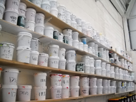
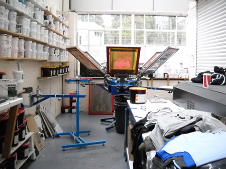
After developing the b a t h letters it was time to take the design to the printers.
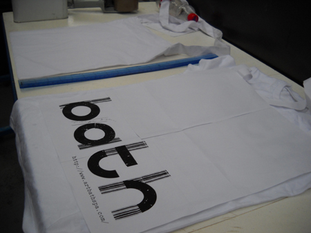
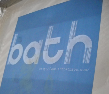
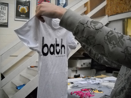

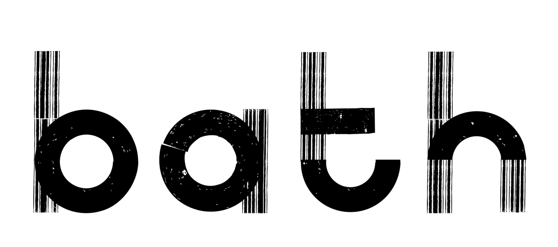
These were the letters I submitted. I created the textures using letterpress lettering and scanned in newspaper borders. I wanted to represent Bath’s history – the vertical lines representing the columns found in bath. I used letterpess textures for the repeating circlular shapes to reflect bath spa’s craft background. I wanted the font to be simple but beautiful, playful and fun. I attempted to make the letterforms slightly haphazard and clumsy to demonstrate this.

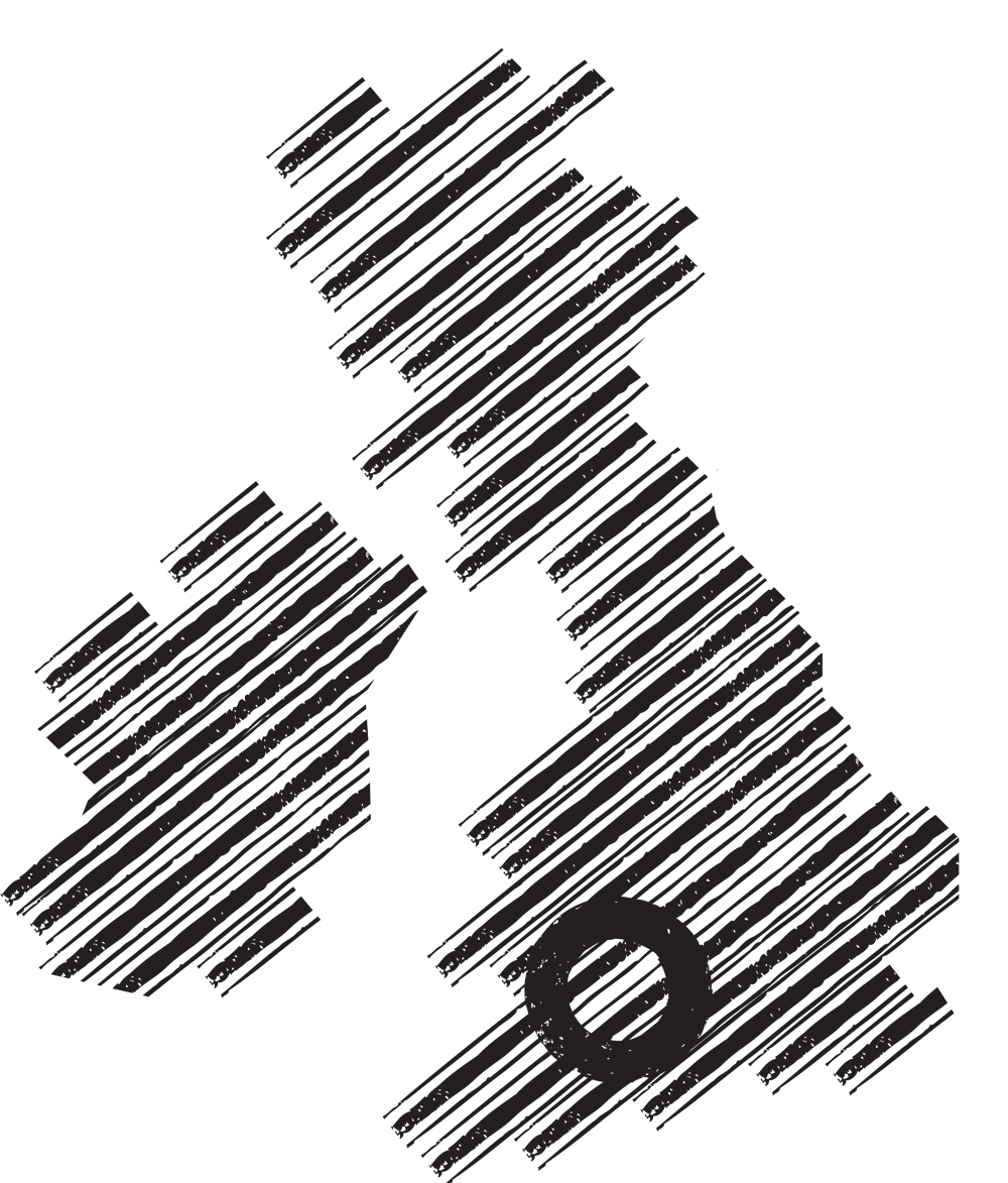
Using these textures I then used it to create a simple map.

This images show the process of creating the 4 letters.

I started by looking at art deco shapes.

Then used the shapes to create the letterforms.

The 4 letters – the A is too hard to read.

However I wasn’t happy with this result as I felt it didn’t represent bath.
We are looking for you to design 4 graphic letters that
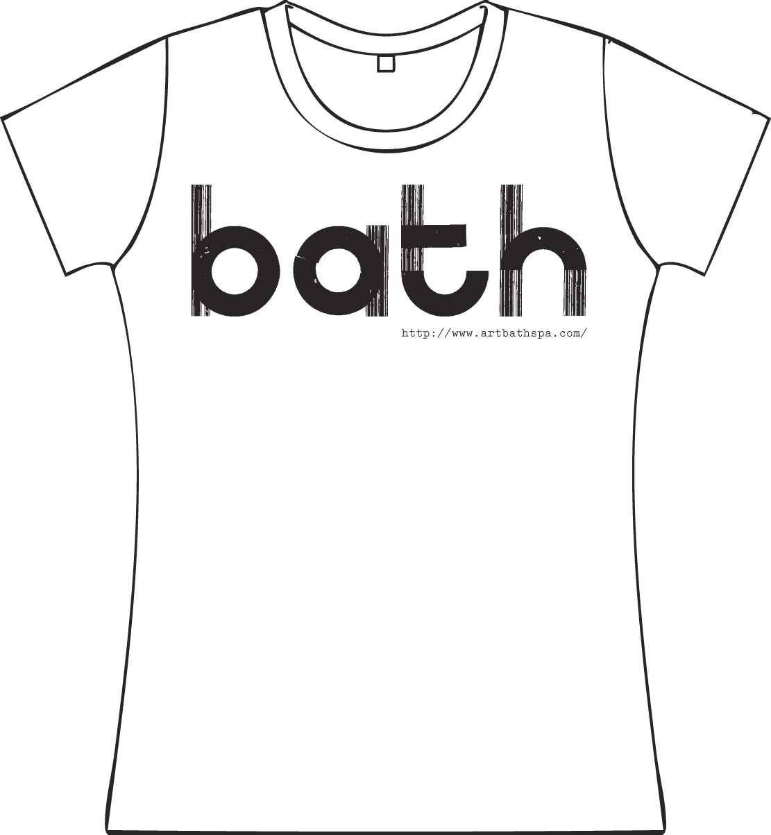
say 4 letters: BATH. We need this for tote bags / T-shirts / maybe badges and will be used for the stand at Ucas fairs in Manchester and London. Your design should be / simple / beautiful / functional / legible. You may approach this in any way you like handdone / painted etc… but remember it has to be functional and read at different sizes. We would also like you to produce a simple map that shows our location
in relation to the rest of britain, students applying always ask
‘where is bath’?