Archive for December, 2009
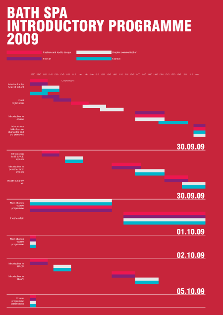
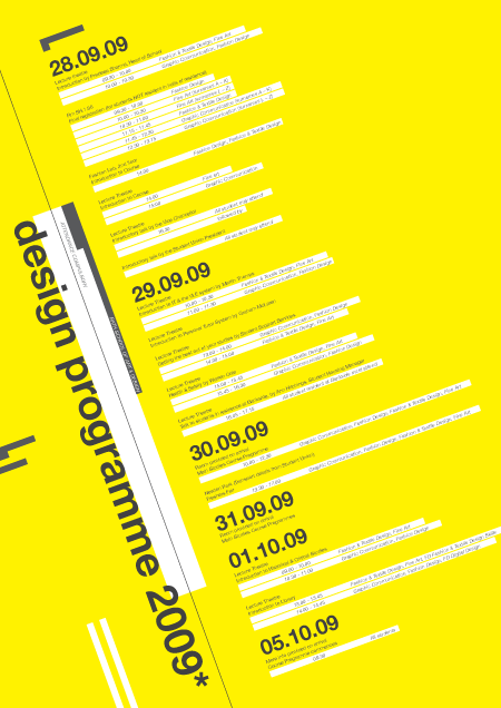
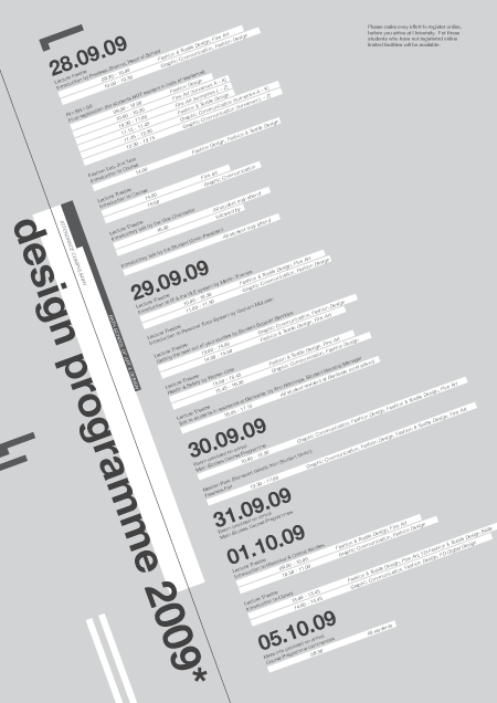
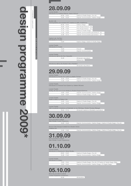
Poster version 2
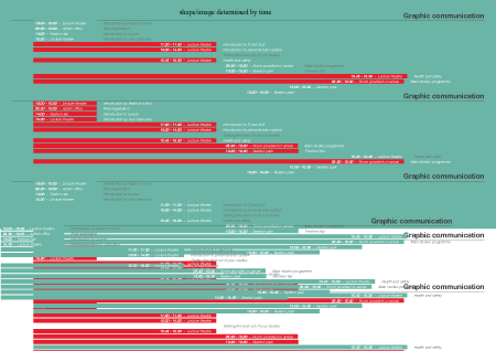
Monday, December 14th, 2009Experiments poster
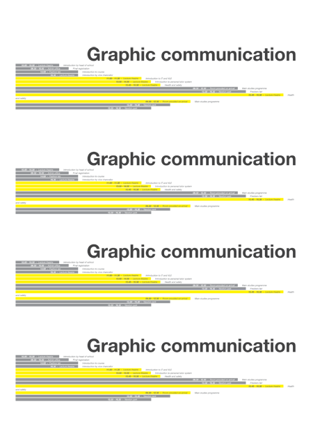
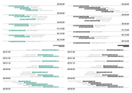
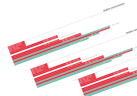
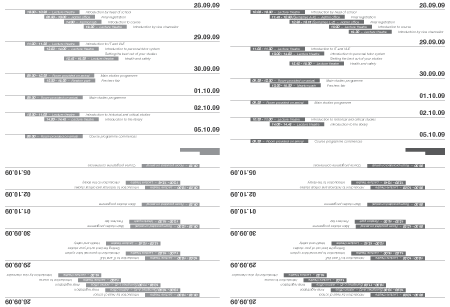
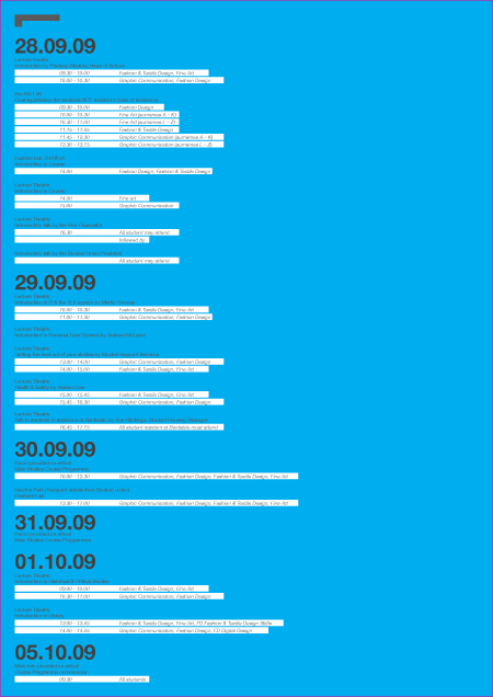
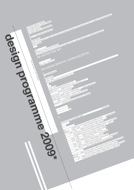
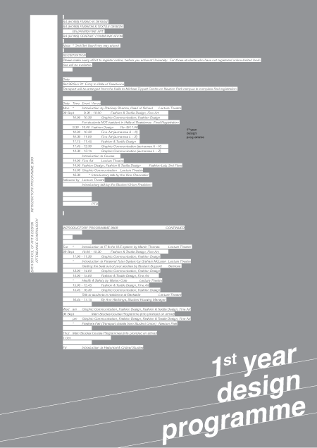
Monday, December 14th, 2009Experiments Leaflet
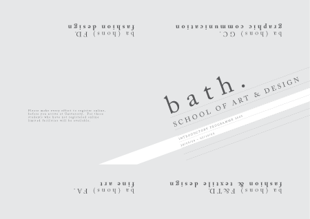
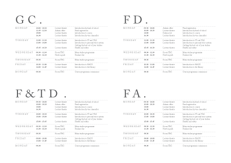
Monday, December 14th, 2009breif 002 final leaflet version 002
Monday, December 14th, 2009breif 002 final leaflet version 001
Monday, December 14th, 2009brief 002
Monday, December 14th, 2009Our next brief was to take the document and turn it into a A4 document. WE could use folds but only 3. As this is a leaflet it needs to be more micro than the poster which is more macro focused.
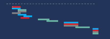
brief 001 – Final image version 001
Monday, December 14th, 2009brief 001 – adding colour
Monday, December 14th, 2009brief 001 – workings
Monday, December 14th, 2009Final sonar movie
Monday, December 14th, 2009I started this project by deciding to apply the darkroom processes to type: expose, wash, fix etc. However with the 20 sec limit – I realised this could be quite tricky. So took one element: light. I experimented using adobe aftereffects to create some movies. I eventually decided to have my type move to waves. This led to incorporating sound. This took a lot os developing and research – but am happy with my end result, as the types outlines are soundwaves which change depending on the wavelength.
Process
Sunday, December 13th, 2009Font made from sound waves. font dances to sound
The letter L dances to sound – test
Experiment with repeating sound waves – 3D
Experiment with repeating sound waves – 2D
Experiment with single sound wave
Applying wave to font test
Light Movie
Box moves to sound – test
photogram bottle spin 1
photogram bottle spin 2
Light test
Blue Tinge
Thursday, December 10th, 2009table top ideas 004
Tuesday, December 8th, 2009I was searching through lots of odd and old objects in my house and found this chocolate box. In it where was an aray of beads, needles, buttons etc but more interesting was that there where some negatives in there aswell dated from the 1960’s.
This intrigued me, and gave me the idea to look at post war nostalgia as a concept for the tabletop. Perhaps the lighting could reflect the age of the negatives. Maybe I could set a scene with this box and an old camera, and some of the developed negatives.
Nostalgia is defined as:
- a wistful desire to return in thought or in fact to a former time in one’s life, to one’s home or homeland, or to one’s family and friends; a sentimental yearning for the happiness of a former place or time: a nostalgia for his college days.
- something that elicits or displays nostalgia.
chinese image
Monday, December 7th, 2009add image here, – find it
I think i should letterpress a whole alphabet
my brief
Monday, December 7th, 2009add info here
produce pieces of work using letterpress/ punch , newspapers, letterpress font book, experiemntal typography.
Nostagia, old techniques/processes
london exhibition visit – letterpress
Monday, December 7th, 2009add info here
Find Context for H.T designing the flag
Saturday, December 5th, 2009Find Context for H.T designing the flag
Also find news articles around the time of the flag was produced, information on the protests, why there was protests etc etc.
Harold thomas
Saturday, December 5th, 2009Born: 1947
Region: Alice Springs, Western Desert
Community Centre: Darwin
Language Bloc: Western Desert
Language: Luritja, Wombaya,
Medium/ Form:
Water colors on arches paper, Acrylic on canvas
Designs:
The National Aboriginal flag. (Harold owns the copyright).
Awards:
1984, Third Prize, Inaugural National Aboriginal Art Award, Northern Territory
Museum of Arts and Sciences, Darwin
Commissions:
1992, Portraits of Parliamentarians, Darwin NT
Collections held:
Art Gallery of Western Australia, Perth.
Flinders University Art Museum, Adelaide.
Museum and Art Gallery of the Northern Territory, Darwin.
Northern Territory Chief Ministers Department.
Queensland Art Gallery, Brisbane.
Exhibitions:
1968, Adelaide, solo exhibition, opened by Don Dunstan, SA
1977, Arnhemland Aboriginal Art Gallery, Darwin, NT
1978, Heritage Aboriginal Art Gallery, Darwin, NT
1985, Esplanade Gallery, Darwin, NT
1986, The Parap Gallery, Darwin, NT
1986, Raintree Gallery, Darwin, NT
1987, Birukmarri Gallery, Fremantle, WA
1987, Esplanade Gallery, Darwin, NT
1988, The Showcase Gallery, Darwin, NT
1988, Caz Gallery, Los Angeles, USA
1989, Masterworks Exhibition, Raintree Gallery, Darwin, NT
Group Exhibitions:
1984, The First National Aboriginal Art Award Exhibition, Museum and Art Gallery
of NT, Darwin
1985, The Second National Aboriginal Art Award Exhibition, Museum and Art Gallery
of the NT, Darwin
1990, Balance 1990: views, visions, influences, QAG, Brisbane.
1993, The Tenth National Aboriginal Art Award Exhibition, Museum and Art Gallery
of the NT, Darwin
Select Bibliography
Try and find out more about this:
ATSIC News Spring 1991.
West, M., 1984, ‘The first national Aboriginal art Award’, in Australian Aboriginal
Studies, Journal of the Australian Institute of Aboriginal and Torres Strait Islander
Studies, 1984, No. 1.
Harold Thomas – Creator of the Aboriginal Flag article
Saturday, December 5th, 2009Harold Thomas is a noted Aboriginal activist and artist. One of his best known designs is the Aboriginal Flag. This simple banner represents strength and passion and has become the emblem for Aboriginal Australians.
HAROLD THOMAS, ARTIST & DESIGNER OF THE ABORIGINAL FLAG: I was born in a small town called Alice Springs in the late-’40s or mid-’40s. And, uh, it was a beautiful place.
But I only spent seven years of my life there and we lived in a segregated area called the Cottages where part-Aboriginals were to live in specially built houses called the Cottages. Whites lived in town. Bush people lived out on the missions and stations.
Well, I’m one out of 13 children. And now I have about 22 nieces and nephews, you know, and so forth. But, yeah, we’ve got a big family. But the sad thing about our family, we — we weren’t all housed under the same roof.
We were removed as children at different stages. The trauma of that as well as not seeing your mother again, virtually — But I was fortunate — I saw her once later on. But you know, your mother’s love is the first great love that a person can have. First, I was institutionalised in Alice Springs with my sisters. I was fostered at 12 to a white family, a priest, a Church of England person, lovely people, until I was — went to art school from there until I was about 20.
I’ve been involved with the stolen generation for the last seven or — well, since it began in the Northern Territory. And that’s an experience, to listen to other people’s hardships. But that’s helped me as well because I’ve never analysed it carefully or in detail, but being with other people who have been removed does help. But, yeah, it’s, uh — it’s an ongoing thing about dealing with that. But it’s not about blame or guilt or anything. It’s about dealing with it, and hopefully, it will help, you know, my family, my children and that to understand what happened to their father.
But I made a decision about going to art school, because, I thought, “At least I won’t be on my own, I won’t have non-aboriginals telling me what to do.” As an institutionalised person, that was really hard to come to terms with. But I persevered, and in the end I got my diploma of fine arts. And it was a great experience, because it was during the ’60s, and during the period of change for a lot of young people throughout the world. And if I were to live again, I’d want to, because it was a great time for young people.
I applied for a job at the South Australian Museum, where I became the first Aboriginal to be employed in a museum in Australia. I was with the biggest collection of Aboriginal art — artefact in the world, and I had virtually free access to it. So I gleaned over every artefact, every design. I sort of went back into it and felt, “There’s something powerful and strong here that should be expressed.”
So it went on from there — it was a sequence of events which led to me being the designer of the Aboriginal flag. When I look carefully at what the Aboriginal flag looks like, it comes from the simplicity and power of Aboriginal art itself. Simple colour, choice of colour, and a simple design. It’s powerful, and the colours are important. And it took some time to think about it — Red ochre, the red soil — the country of Australia is all red.
Why I chose the sun? Because it’s another colour that is used commonly in Aboriginal art — yellow ochre. But the sun is a great symbol for all people. When we look carefully at the colour black, which is an interesting one, it’s more of a political inclusion, rather than a spiritual, Aboriginal concept. The black represents the pride of being black in Australia. Because, at the time, black pride came into Australian culture — during the ’60s and ’70s — influenced by Black American pride of their culture. If this is going to be an Aboriginal flag, it has to have black, because it represents the black people of the continent.
When we looked back, a lot of people were ashamed of their Aboriginal identity, because of that suppression. Well, the flag kind of helped that.
They said, “At least, if I can wear it on myself, wear a T-shirt with it, or the colours, it’s a signal to other people in the community I’m proud I’m Aboriginal, I’m proud to wear the colours.” And that’s important — I like that. Now and again, I see a non-Aboriginal wear it, and that’s even — good too. I enjoy that. It’s not just exclusively Aboriginal. It’s got a life of its own. It’s everywhere.
The Aboriginal Flag
Saturday, December 5th, 2009The basis of my presentation will begin with the aboriginal flag which was designed by Harold Thomas
Things to research/present
-
Give brief context of Australian around 40s-90s (show Australian flag?)
- aboriginal life
- migrations/immigration
-
A brief background into the Aborignal flag
- colours
- shapes
- why it was created?
- what it’s use is/ was
- explain how most flags start life
-
About Harold Thomas
- context for producing the flag – protest
- where he grew up
- how he lived his life?
-
Image ideas
- Australian flag
- aboriginal flag
- aboriginal /Australian flag
- immigration posters
- photos of an aborginal / aborginal art
- Harold Thomas
- Photos of people immigrating to austraila by boat etc
- map showing immigration to Australian by country (find or design)
- photos of life as aborignal/ austrailian desert/land/sund
- Australian politics/politicians
- newspaper reports/stories
- photo of christian missionaries – white and black
- aborginal life
- children being torn away from their homes/families
- there new communities (homes built for aborignals)
- aboriginal protests
- cathy freeman winning a race and lifitng the aboriginal flag
what is Pecha Kucha
Saturday, December 5th, 2009Pecha Kucha (ペチャクチャ?), usually pronounced in three syllables like “pe-chak-cha”, is a presentation format in which content can be easily, efficiently and informally shown, usually at a public event designed for that purpose. Under the format, a presenter shows 20 images for 20 seconds apiece, for a total time of 6 minutes, 40 seconds.
It was devised in 2003 by Astrid Klein and Mark Dytham of Tokyo’s Klein-Dytham Architecture (KDa), who sought to give young designers a venue to meet, network, and show their work and to attract people to their experimental event space in Roppongi.[1] They devised a format that kept presentations very concise in order to encourage audience attention and increase the number of presenters within the course of one night. They took the name Pecha Kucha from a Japanese term for the sound of conversation (“chit-chat”).
Klein and Dytham’s event, called Pecha Kucha Night, has spread virally around the world. More than 170 cities now host such events.
My presentation will be a mini version of this taking half the time with half as many slides.
Pecha Kucha Brief
Saturday, December 5th, 2009You are to take one piece of work and make a presentation about the grouo or individual responsible for producing it.
you may base the presentation around the selected work example or extend your research to cover other work by the pracitioner.
Your presentation should give a context for the work of the pracitiotioner and some insight into the areas of work they may engage in and why.
The presentation will take the form of a mini pecha kucha; 10 slides and each on screen for 20 seconds
Please note that your presentation will be assessed at the time of delivery.
Darkroom experiements part001
Saturday, December 5th, 2009- 5 second intervals
- 2.8 aperture
- 3 contrast filter
Experimenting with contrast filters (left)
- 5 second Intervals
- 2.8 aperture
- 5 contrast filter
Experimenting with no contrast filter (right)
- 5 second Intervals
- 2.8 aperture
- NO contrast filter
- 20 seconds
- 8 aperture
- 3 contrast filter
- 5 second intervals
- 8 aperture
- 3 contrast filter
- 20 seconds
- 8 aperture
- 3 contrast filter
Experimenting with water
- 5 second intervals
- 2.8 aperture
- 3 contrast filter
test strip (left)
- 5 second intervals
- 8 aperture
- 3 contrast filter
test strip (right)
- 5 second intervals
- 8 aperture
- 4 contrast filter
- 45 seconds
- 8 aperture
- 4 contrast filter
book layout design 003
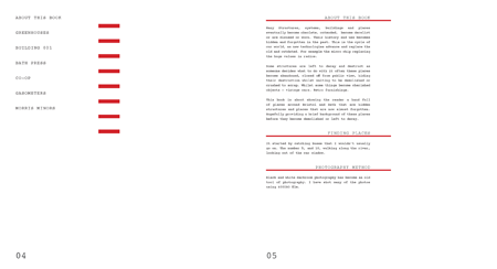
Saturday, December 5th, 2009After research I came up with the following design.
7×7 grid with 10mm gutters
16 margin spacing
font: palatino
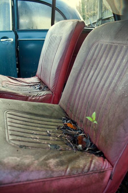
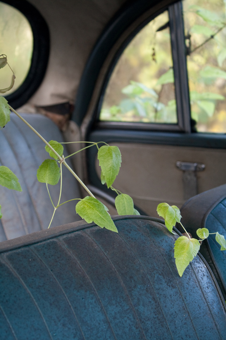
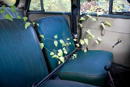
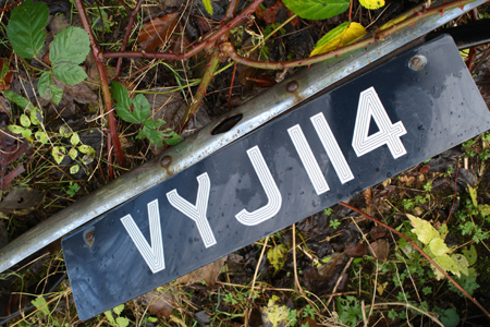
One of the reason of choosing palatino is that I wanted to create age to the book. As this book was inspired by finding morris minors I decided to choose palatino because it was created in the same year – 1948 that the morris minor was created too. The greyish blue colour choice is also inpsired by the car.
book layout design reasearch
Saturday, December 5th, 2009I was advised to re-think my design/font choice so researched into this.
i looked at grids.

