Archive for May, 2011

D&AD illustration inbook award

Monday, May 23rd, 2011

d&ad student awards

The brief was to CREATE AN ILLUSTRATED INTERPRETATION OF A MUSICAL TRACK THAT IS EXPERIENCED BY THE VIEWER IN AN UNCONVENTIONAL AND PIONEERING WAY.

I chose 2 Kraftwerk tracks, computer world and radio-activity.

I created a simple program that reacted to user interactions via a microphone input. I filmed the program reacting to the interactions of the 2 tracks and illustrated each frame, placing the designs onto products such as wallpaper, ties and mugs. My entry won an d&ad inbook student award.

click on the images to view my entry.

fleur-isbell-3

fleur-isbell-4

fleur-isbell-5

fleur-isbell-6

Kraftwerk mapping sequences

Monday, May 23rd, 2011

The idea came from analogue distorted patterns. Trying to reflect electronic/anlogue/data/computers etc.

IMG_0589

Film sequences created by playing tracks to flash program. The flash program responds to a microphone input. Blocks flash black/white flash on/off according to amplitude/microphone detection. Sequence and timing is determined by microphone.

Click on image to view Kraftwerk “intermission” movie


Click on image to view Kraftwerk “pocket-calculator” movie


I then drew out each frame from the recording and created a mapping sequence.

.

1111111111111111111111111111111

Intermission mapping sequence

img005

As part of the brief was to incorporate fan interaction. I asked fans of kraftwerk to listen to tracks and recorded their interaction with the microphne whilst listening to the kraftwerk tracks, I then mapped the frames and placed the mapped pattern onto ties, mugs, and items that could be used for promotion.

IMG_0656

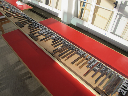
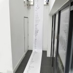
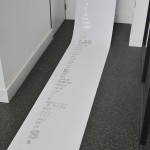
To illustrate the pocket calculator track, I printed each frame, trying to match pattern frequencies.

IMG_0594

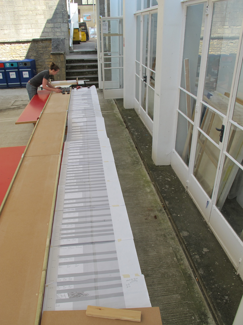
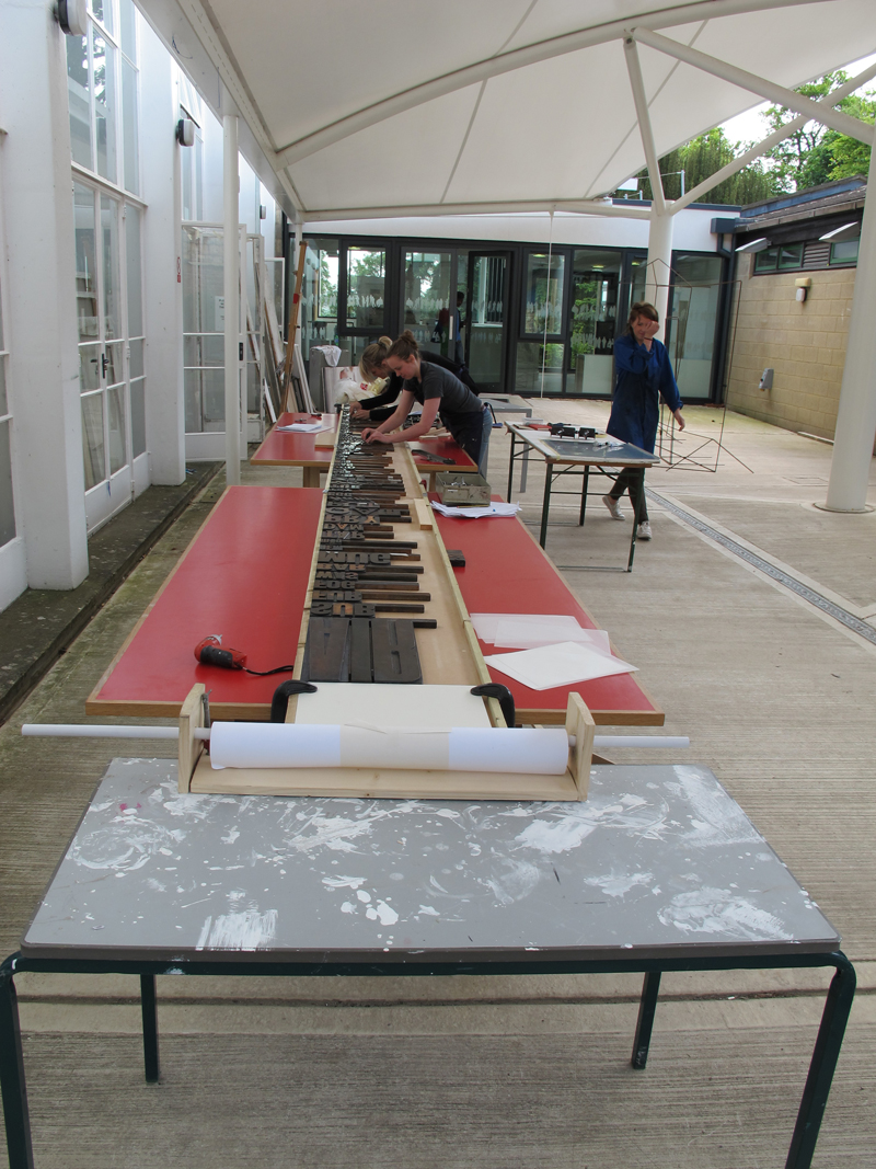
Calculating the frequency of frames

Picture 9

I then matched the frequency of the frames to the size, thus the higher number of frame repeats the bigger the frame.

img0033

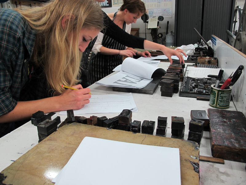
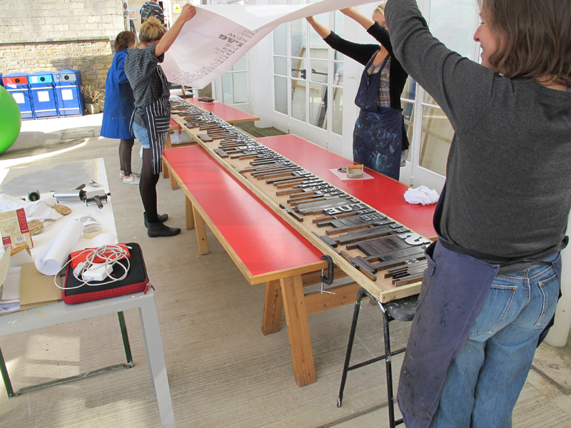
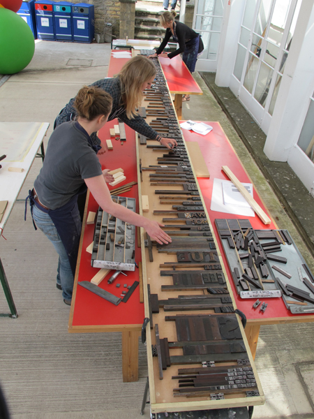
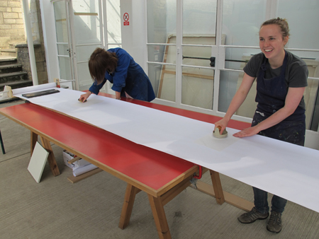
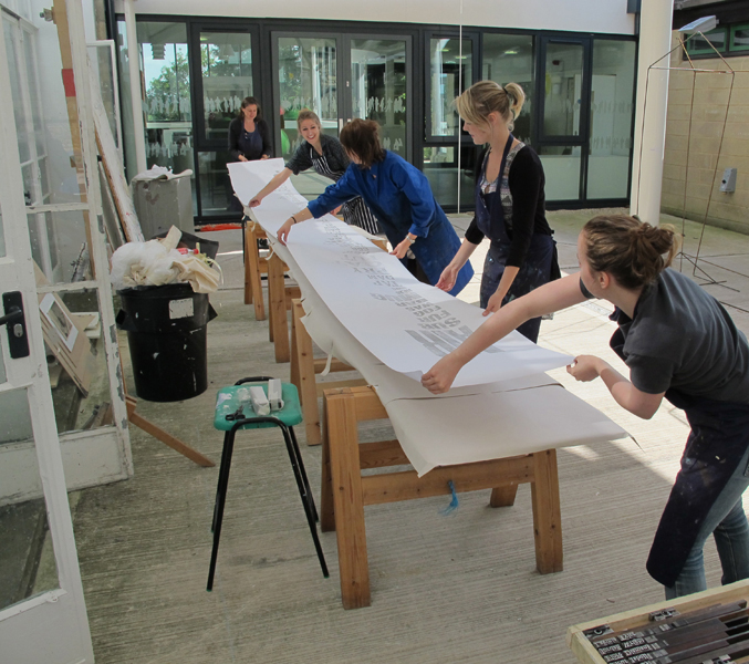
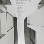
this got a big complicated at times – my desk

IMG_0605

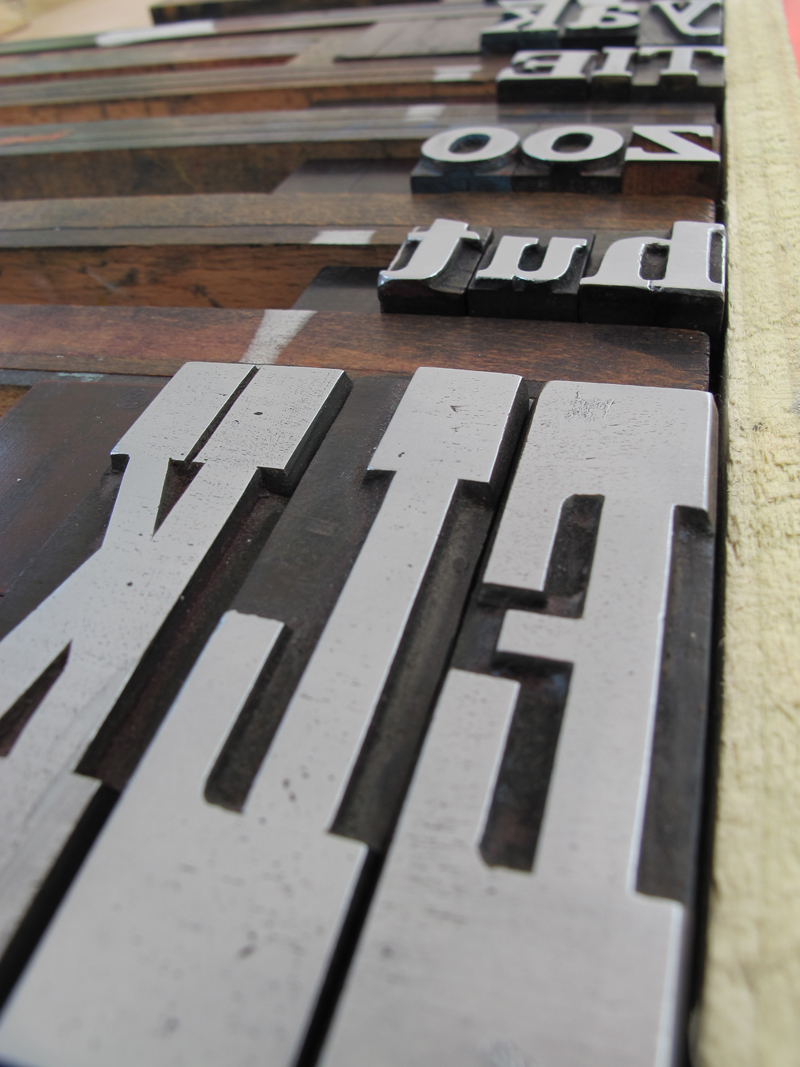
I then experimented with composition, using a photocopier to play, distort scale, invert and cut and paste.

sbIMG_2794

sbIMG_2791-2

Letterpress Catalogue

Sunday, May 22nd, 2011

I set out to catalog all the wooden type available to students. I produced a catalog book and printed banner to promote letterpress at the university.

Each spread displayed in actual size the printed font as well as name, size, style and weight information. The right page included a count of how many and what characters are available.

IMG_2839190

A section at the front of book gave an explanation of useful tips and guide

IMG_2841192

As well as categorizing the 67 fonts available into serif, sans slab I also catogorised a sub section with numbers, punctions and borders etc.

IMG_2853201

A spread from the punctuation section

IMG_2854202
.
IMG_2874214

The cover can be used as a ruler as the lines are drawn in pica increments. The line measurements are then carried throughout the book to help the user understand the letterpress sizes. The diagram also represents the letterpress cases in the studio.

IMG_3006181

IMG_30041802

letterpress on a giant scale

Saturday, May 21st, 2011

eIMG_1985

I wanted to demonstrate the variety of wooden letterpress type at bath spa uni. There are 67 fonts and nearly 4,000 forms. So with help from fellow students we printed 3 letter words per font and printed a giant banner. The words chosen were randomly generated from 400, 3 letter words. I then numbered each word and used a number generator to select each word to form a 67 line poem. hopefully this reflected the often unpredictable nature of letterpress.

come see it at bath spa graphic communication uni show for the final unveiling. June 10 – 14th 2011.

IMG_1914

To print the 6m banner a special wooden chase was made that connected together from 3 parts. this was clamped to 3 tables. A spool with a roll of paper was rolled on top of the chase. The banner was then hand printed using a barren. Click on the images to view the process

6.5 metre banner photos

02

01

03

A special thanks to Flore Diamant, Jordan wright and Lavinia Tyler who helped to print the banner.
you can view this on the creative review feed. http://www.creativereview.co.uk/feed/may-2011/21/letterpress-on-a-giant-scale

Iceland book

Tuesday, May 17th, 2011

The book cover was made from dark greyboard, reflecting the ash and dark covered landscape. I then silkscreened the type of the cover. The book was bound with an exposed spine.

IMG_29921492

Some selected spreads

IMG_2973136

IMG_2974137

IMG_2970133

IMG_2965128

IMG_2984147
.
IMG_2978141

Bath final logo

Monday, May 16th, 2011

Brief: design four letters that reflect the Bath Spa, Art and Design School. My design was chosen, see below for final Logo and designs

fleur_isbell_portfolio

logo elements can be used for further mailer promotion etc.

fleur_isbell_portfolio44

Often people are asked, “Where is Bath?” I created a simple map using textured elements.

fleur_isbell_portfolio22

My designs implemented at the UCAS design fair

DSCN12333

BATH Letterpress alphabet

Sunday, May 15th, 2011

Being a big fan of letterpress, I turned the font I created into a printable font that could be used in the letterpress studio:

Printing blocks

IMG_3030123

Alphabet printed using laser cut printing blocks

IMG_27422

Laser cut files

Picture 2

Scriptease printed book

Sunday, May 15th, 2011

My design was chosen for the cover of the MA Creative writing book, “scriptease” Here is the printed book.
.
IMG_3023126

Inside page:

IMG_3022125

bath letter components

Sunday, May 15th, 2011

BATH elements2